EconoMe

Gamifying financial literacy to master money management skills for lifelong financial freedom.
Role

UX Designer

Teammates

Evan, Matt, Trudy, Kenya

Date

2.6.24 - 5.11.24

Course

INST 367

Context

EconoMe transforms the daunting task of financial education into an exciting gaming adventure, making complex concepts like

investing and budgeting accessible and engaging for young adults. EconoMe keeps students motivated and on track towards

achieving financial literacy and independence.


As a UX Designer, I led the UI designs, User Research, and prototyping.

Summary

Summary

Gamifying Financial Freedom.

To address the challenge of financial literacy among young adults and students, we developed EconoMe. Our app gamifies the

learning process, allowing users to engage in fun and interactive games, quizzes, and social challenges that simplify complex

financial concepts like investing and budgeting. We customize the learning experience based on user input regarding their

financial goals and current knowledge, empowering them to progress toward financial independence effectively.


User Research

Navigating the Financial Learning Curve.

Financial literacy, a crucial skill for navigating adult life, often presents a steep learning curve for young adults

and students. To better understand college students pain points with their finances we conducted 9 moderated

user interviews.


User Pain Points:


Lack of Financial Literacy

Many college students are not financial literate and don’t understand many of the terms that they would need
to understand to become financially free. Many college students attitudes towards financial literacy is that they

are confused, stuck, and frustrated.


Short Term Financial Goals

A large amount of college students do not invest or save their money. This ties back into not being financially

literate and many students feel that their classes are not setting them up for their future financially. A lot of

college student spending were groceries, student bills, and going out.


Budgeting

Many college students are bad at budgeting or use basic tools such as Excel to budget. This often causes a lot

of college students to overspend and go over their budget. Thus, not focusing on long-term financial goals and

worrying about money.


User Pain Points:


Lack of Financial Literacy

Many college students are not financial literate and don’t understand many of the terms that they would need
to understand to become financially free. Many college students attitudes towards financial literacy is that they

are confused, stuck, and frustrated.


Short Term Financial Goals

A large amount of college students do not invest or save their money. This ties back into not being financially

literate and many students feel that their classes are not setting them up for their future financially. A lot of

college student spending were groceries, student bills, and entertainment.


Budgeting

Many college students are bad at budgeting or use basic tools such as Excel to budget. This often causes a lot

of college students to overspend and go over their budget. Thus, not focusing on long-term financial goals and

worrying about money.


Ideation

Affinity Diagram

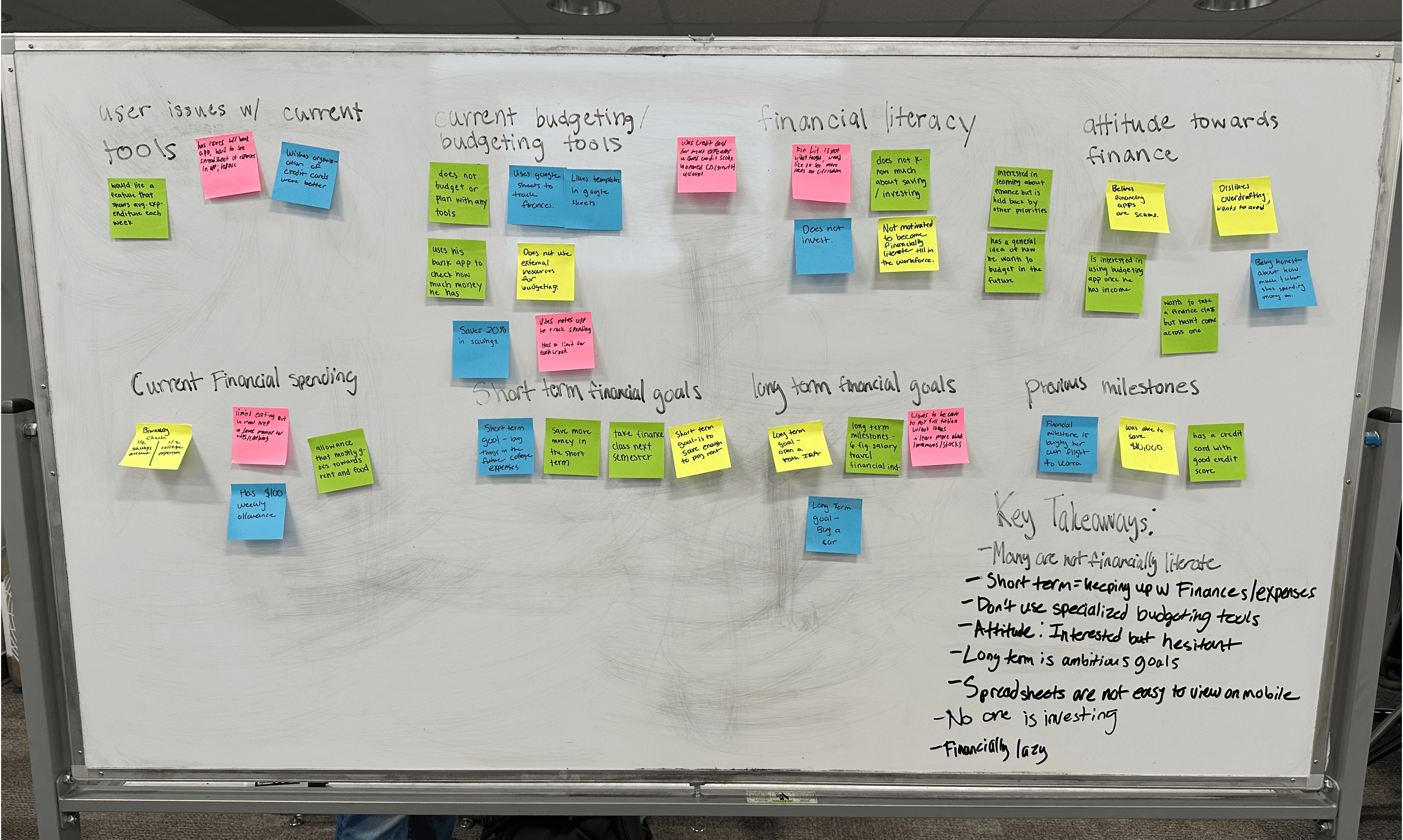
We organized our notes and insights into major themes from our User Research to identify the major pain points and snuggles of college students and their finances.

We organized our notes and insights into major themes from our User Research to identify the major pain points and struggles of college students and their finances.

Ideation

Moodboard

Took inspiration from our competitors as well as websites such as Dribble. We wanted a energetic and simplistic theme.
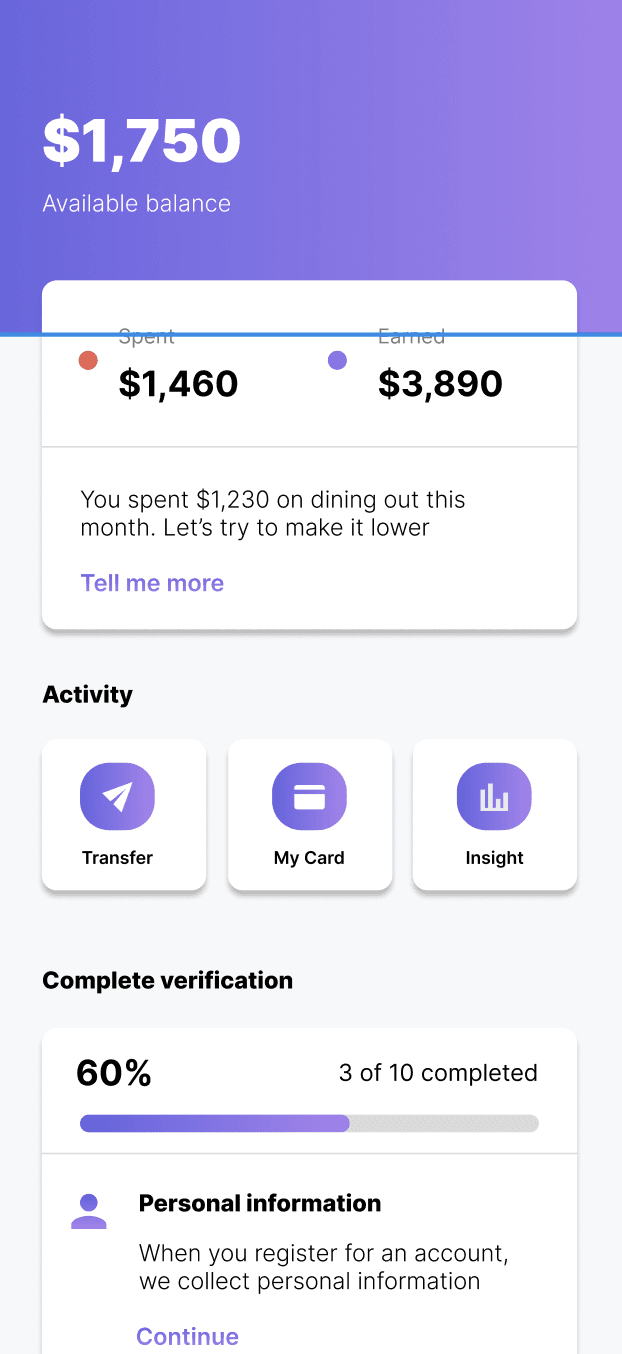
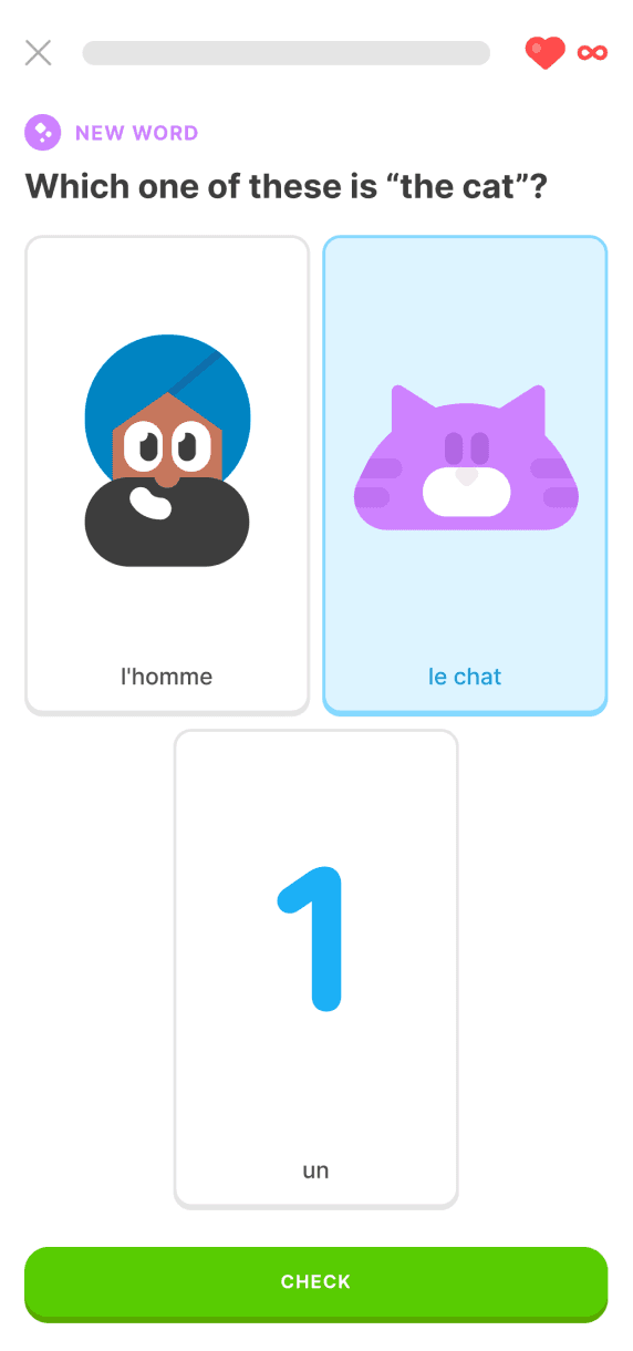
Inter

Font

Colors

Inspo

Prototyping

Mid Fidelity Prototype

The goal of the mid-fidelity prototype was to expand on the paper prototypes I drew, considering more of the major elements and how they would appear in a screen-based design. We focused on the budgeting section in order to tailor users pain points and needs. From here, I was able to showcase much of the outline.

Testing

Usability Study

We conducted 5 unmoderated usability tests to test the functionality of the application. After gaining valuable insight and

feedback on my prototype, I made changes in the design. The feedback from my users’ test:


1. Get Rid of Budgeting Aspect

From our user testing, we observed that many users were confused about how the budgeting aspect of EconoMe blended

with the financial literacy aspect. We came to understand that our initial idea for EconoMe was too ambitious, and we

refocused our app on the main pain point: college students not being financially literate.


2. User Flow & Continuity

Users became confused about the user flow after completing a learning module. To address this, we created a badge

system to reward users for playing the game and also established goals for them to complete throughout the learning

modules.


3. Challenging Users

Many users felt that the learning modules were not challenging enough and were too easy at times. To address this

pain point, we created a quiz module that allows users to test their knowledge without immediate answer checks,

enabling them to enhance their learning experience.

We conducted 5 unmoderated usability tests to test the functionality of the application. After gaining valuable insights and

feedback on my prototype, I made changes in the design. The feedback from my users’ test:


1. Get Rid of Budgeting Aspect

From our user testing, we observed that many users were confused about how the budgeting aspect of EconoMe blended

with the financial literacy aspect. We came to understand that our initial idea for EconoMe was too ambitious, and we

refocused our app on the main pain point: college students not being financially literate.


2. User Flow & Continuity

Users became confused about the user flow after completing a learning module. To address this, we created a badge

system to reward users for playing the game and also established goals for them to complete throughout the learning

modules.


3. Challenging Users

Many users felt that the learning modules were not challenging enough and were too easy at times. To address this

pain point, we created a quiz module that allows users to test their knowledge without immediate answer checks,

enabling them to enhance their learning experience.

Testing

Accessibility Considerations

1. Color Contrast

Used a dark background with white text to allow users with bad vision or with disabilities to use the website or app.


2. Visual Hierarchy

I used headings with different sized text for clear visual hierarchy.


3. Landmarks

I used landmarks to help users navigate the site, including users who rely on assistive technologies.

Prototyping

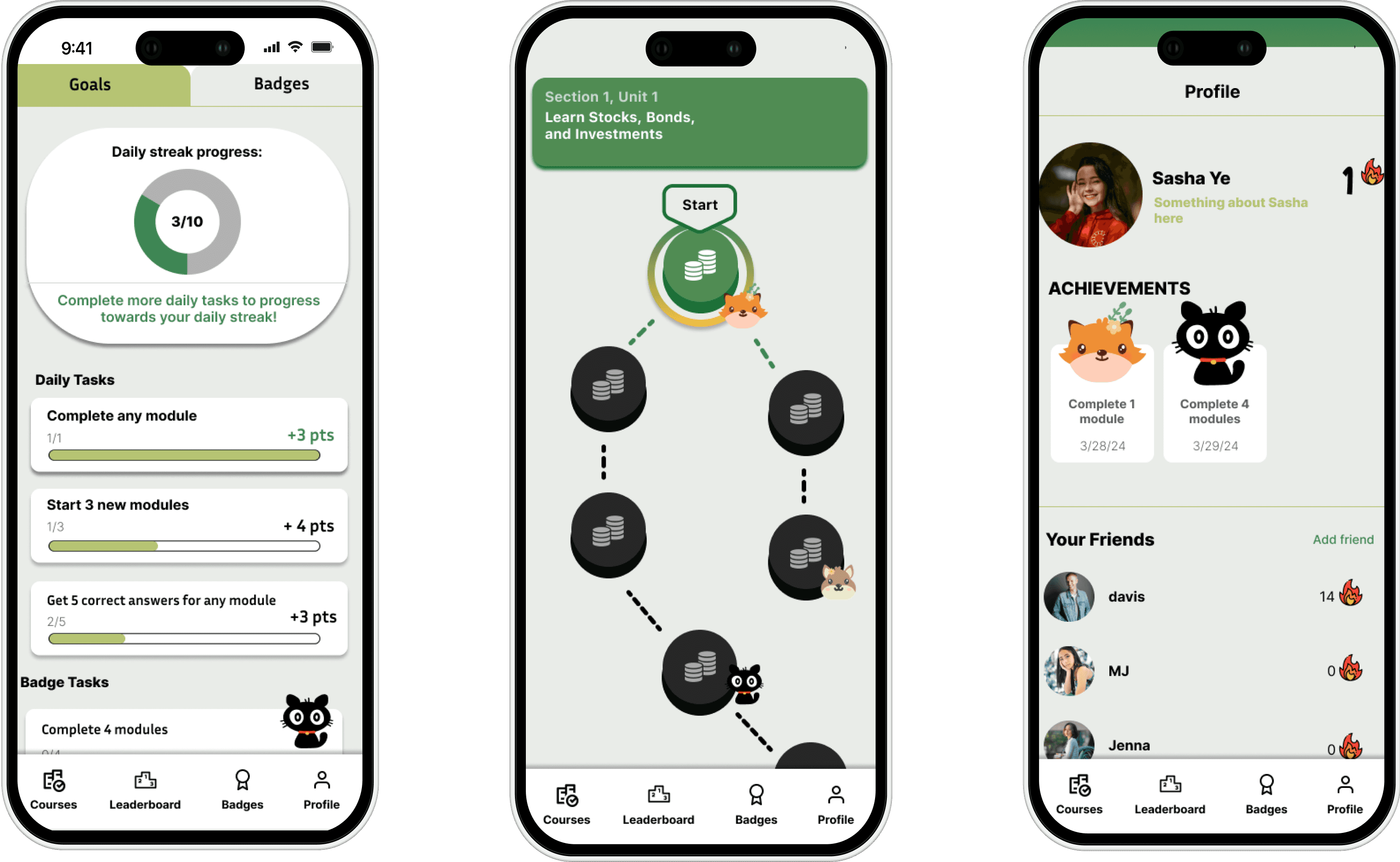
Final Mockups

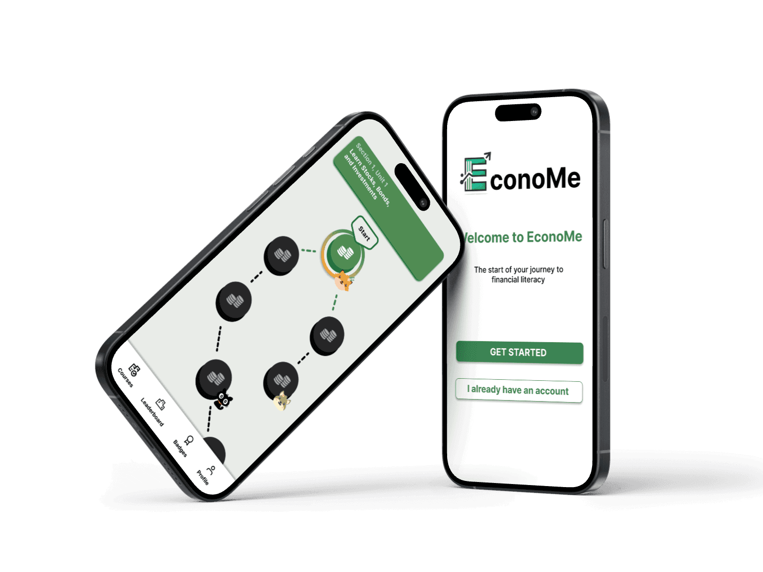
EconoMe is revolutionizing the way young adults approach financial literacy. By addressing the enduring challenge

of understanding complex financial concepts, EconoMe leverages interactive technologies like gamification, real-time

feedback, and social connectivity. This integration allows the app to offer personalized financial education tailored to

each user's learning style and financial goals, making the journey towards financial independence engaging and accessible.

Future

Key Takeaways & Next Steps
What I learned:


Working with a Large Team

I learned how to communicate my design ideas with multiple team members and designers, enhancing collaboration and ensuring that all perspectives were integrated into the final product.


Importance of User Testing

I discovered the value of continuously iterating on my designs by actively seeking feedback and making the necessary adjustments to refine and improve my work.


Presenting my Design Ideas

I honed my ability to present my designs effectively to stakeholders by crafting high-fidelity prototypes and comprehensive presentations, and learned to confidently address questions and justify my design choices.


Next Steps:


Continuing to iterate and test

We so far have only tested our designs with classmates at UMD. We need to test our app designs with people who are financially literate and complete beginners to gain more insights and iterate on our designs. 


Build out more of the courses

Some of course topics are not fully designed yet such as the budgeting and taxes modules.


Responsive Web 

A responsive web design can be helpful for students who do not own cell phones or find them distracting making our application more accessible and intuitive.


Prototyping

Paper/Low Fidelity Prototype

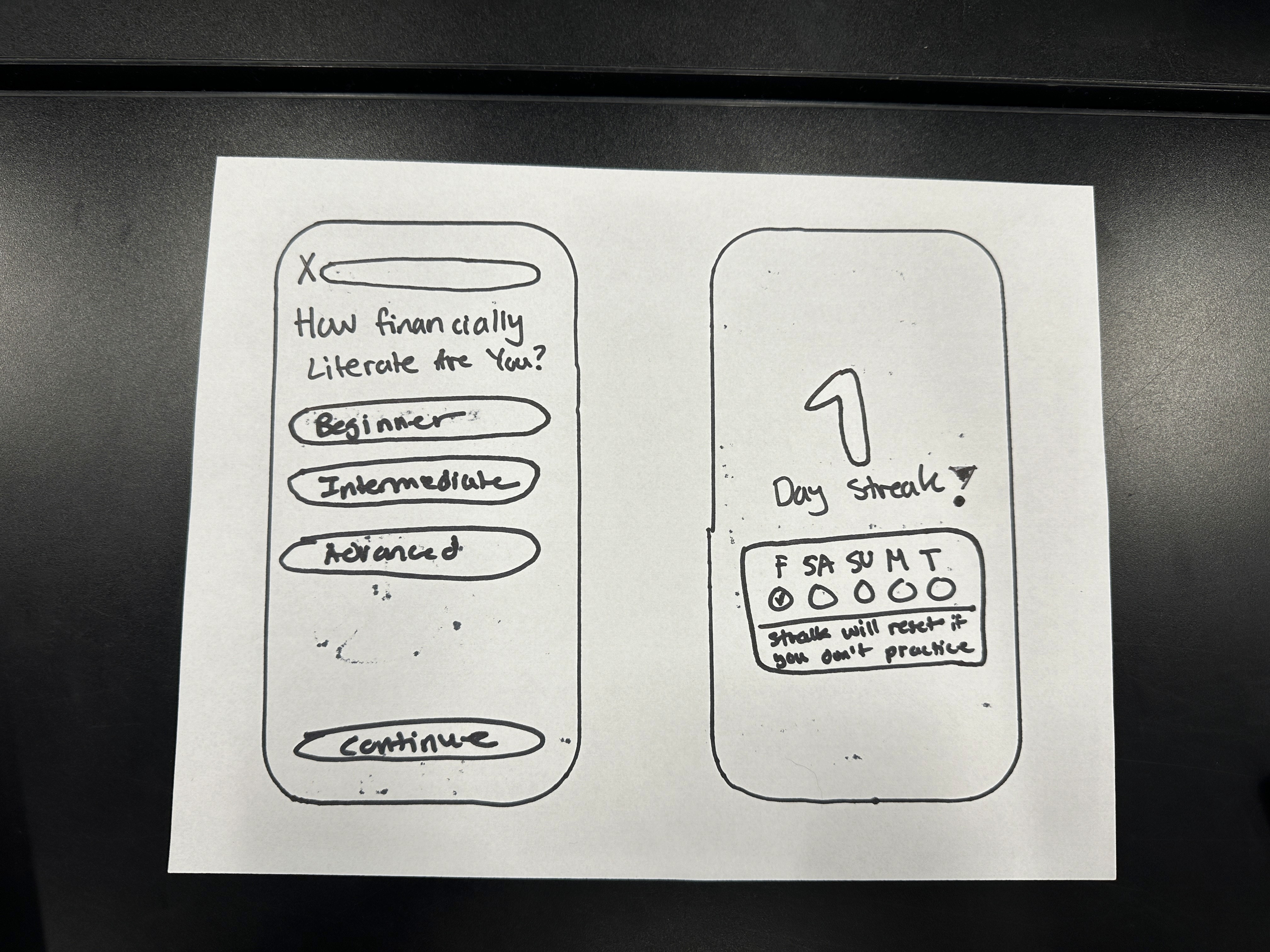
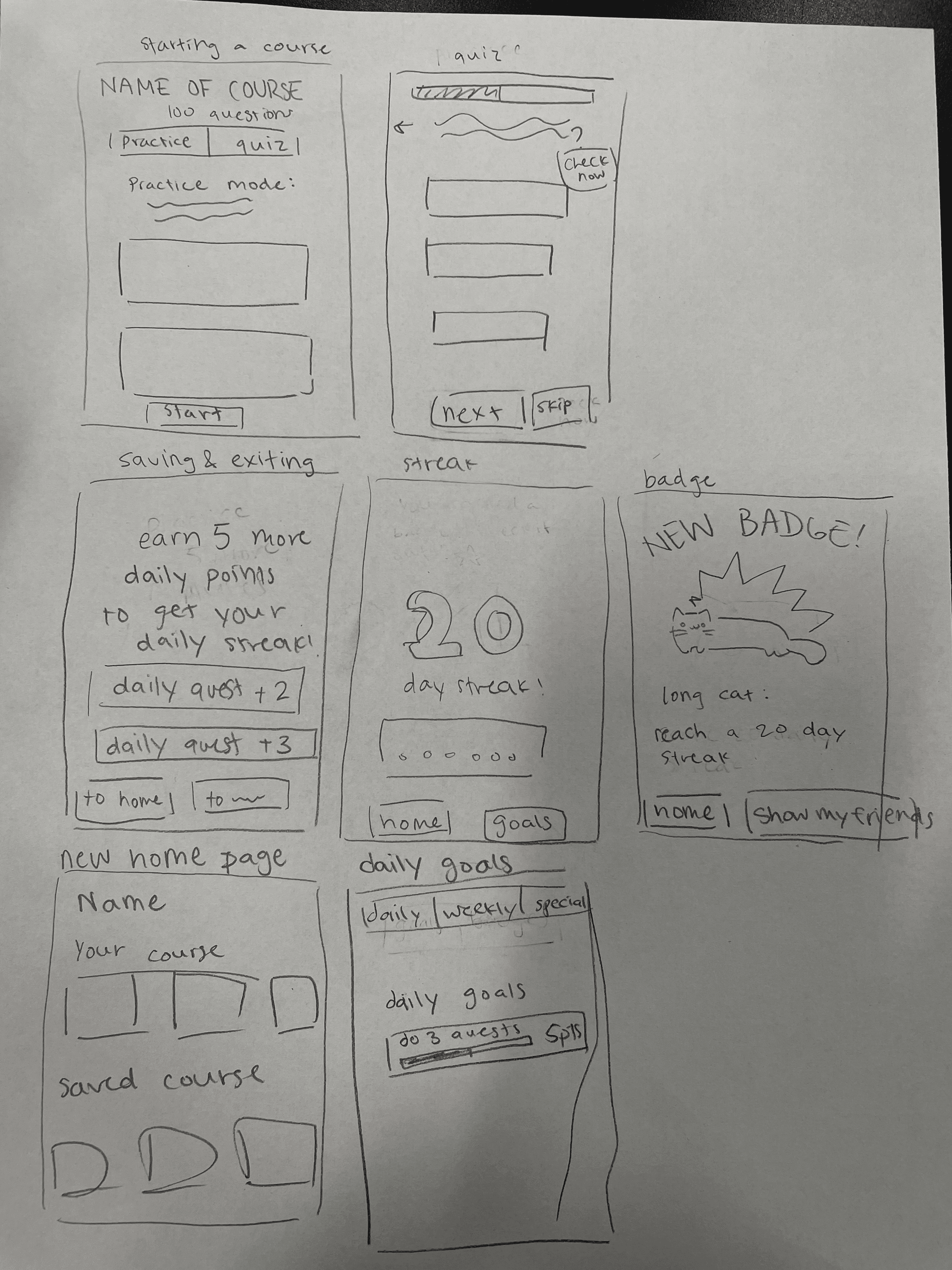
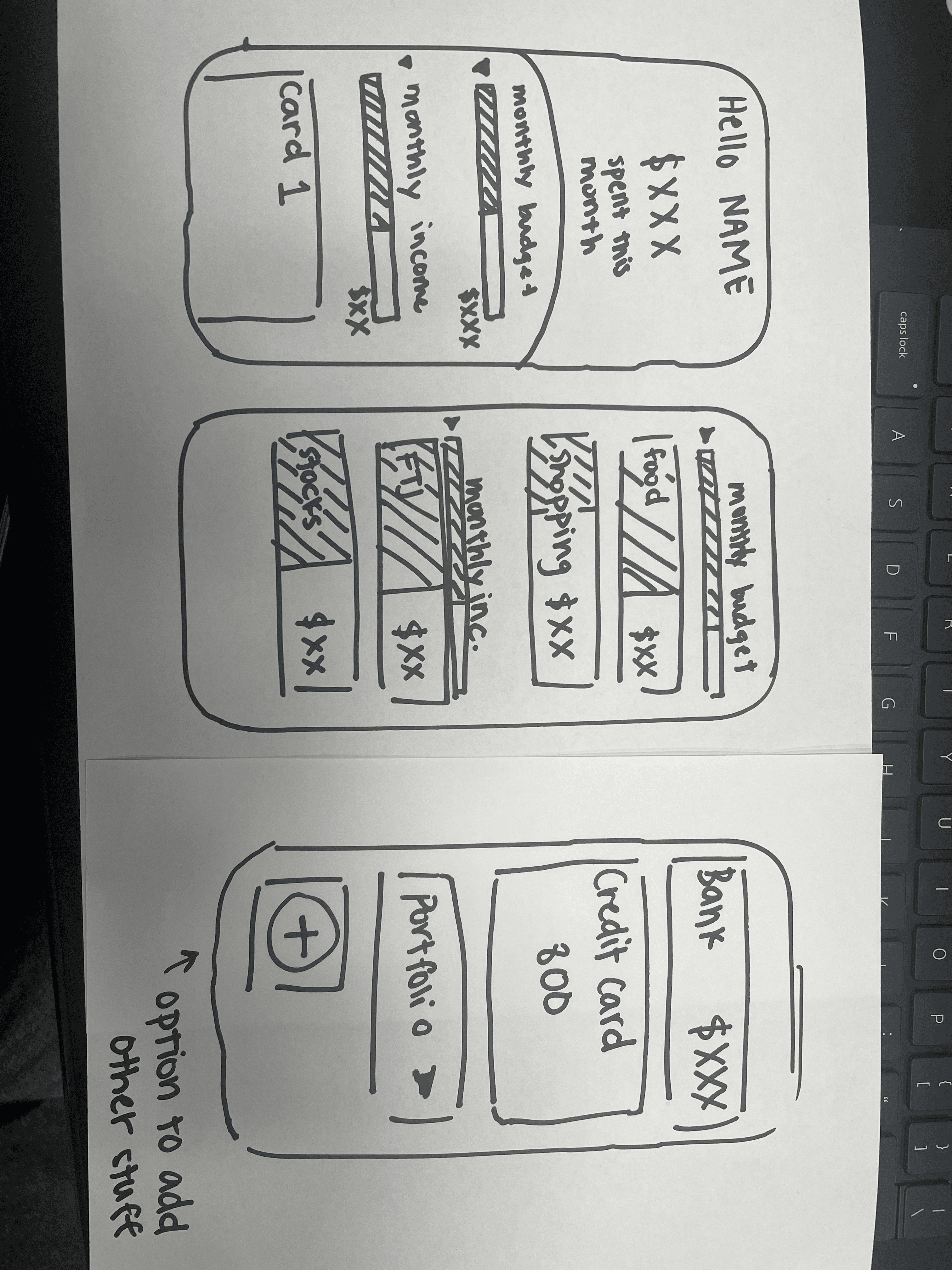
We then started to create our initial designs on paper to gain a sense of how we can set up our prototype for success.


Prototyping

Paper/Low Fidelity Prototype

We then started to create our initial designs on paper to gain a sense of how we can set up our prototype for success.