Testing
Accessibility Considerations
1. Color Contrast
Used a dark background with white text to allow users with bad vision or with disabilities to use the website or app.
2. Visual Hierarchy
I used headings with different sized text for clear visual hierarchy.
3. Landmarks
I used landmarks to help users navigate the site, including users who rely on assistive technologies.
SUMMARY
Stride in Sync.
In order to further encourage a healthy lifestyle and use quality performance footwear, we created Sole Stride. Our product
allows users to seamlessly find and purchase the most optimal pair or pairs of shoes to fit their running needs, and tracks
their progress in them. We tailor our footwear search process to each user’s needs based upon their input regarding several
factors pertaining to their preferences, physical makeup, and abilities as a runner.

Finding the Perfect Pair of Running Shoes.
Running, for many, is a wonderful way to exercise, reflect, and push oneself. One of the biggest hurdles (pun intended),
however, is finding the right pair of running shoes. Factors pertaining to price, materials, and especially performance
make the process of finding and loving running shoes a complete hassle. Additionally, running shoes have a finite lifespan.
User Pain Points:
Difficulty in Understanding Shoe Specifications
Users, especially those new to running, may find it challenging to understand the technical specifications
and terminologies used in running shoes, such as heel-to-toe drop or cushioning types. This can make it
hard for them to decide which shoe might best suit their needs.
Inaccurate Shoe Fit
Predicting the perfect fit and comfort level of a shoe without physically trying it on can be problematic.
Users might experience discomfort or poor performance if the shoes do not match their expected fit
or fail to adequately support their running style.
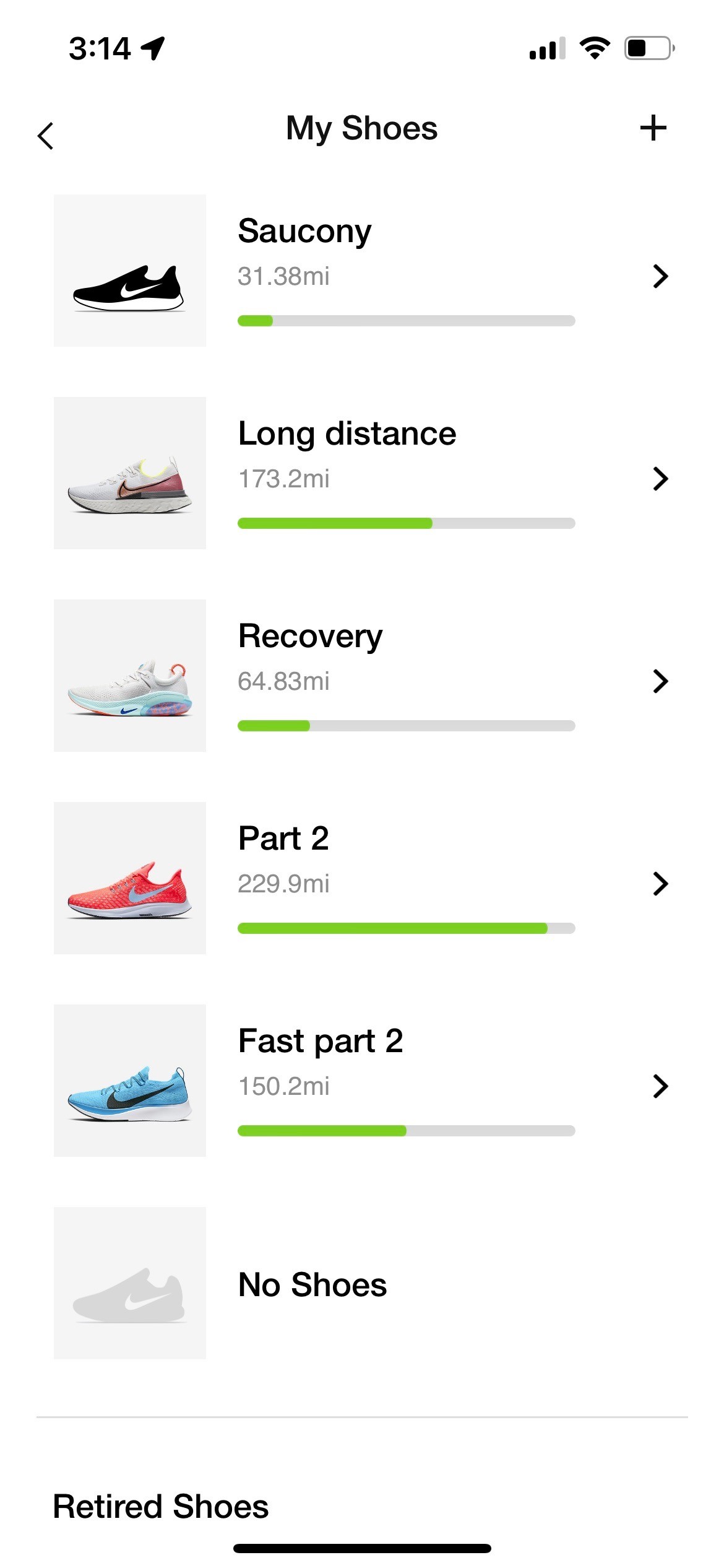
Tracking and Managing Shoe Lifespan
Users may struggle with understanding when it's time to replace their running shoes based on wear and tear or
performance degradation. Users need clear, actionable insights on shoe lifespan to prevent injuries and ensure
optimal performance, which might not always be accurately provided through an app.
User Research
Competitor Analysis
Nike Run Club (NRC)
Pros
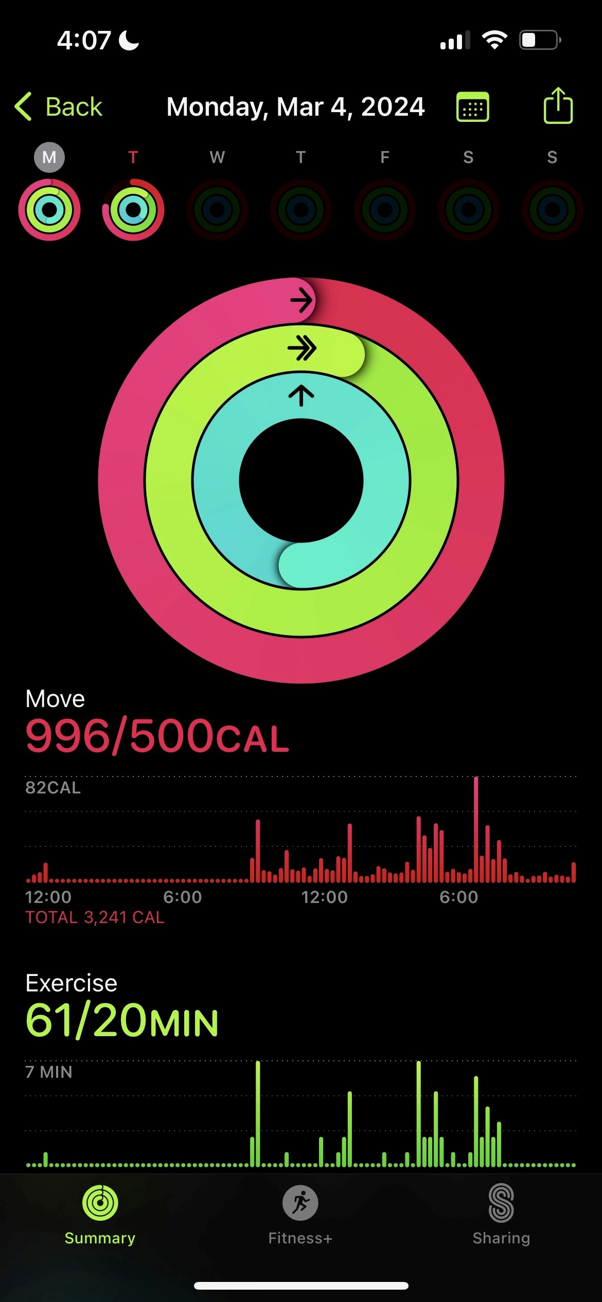
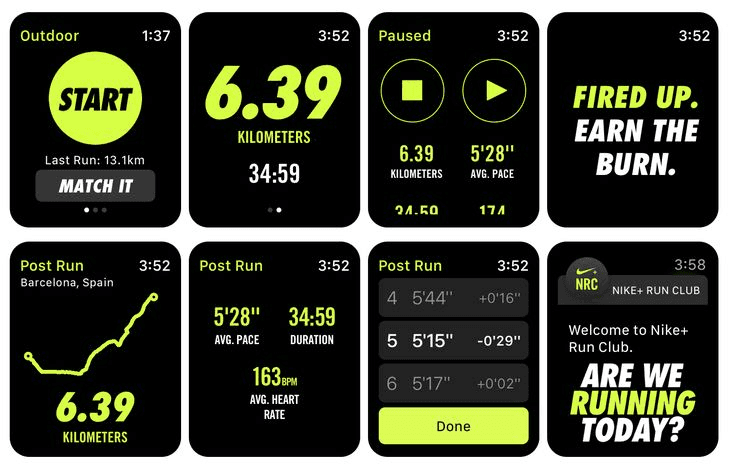
Tracking and Metrics: NRC provides comprehensive tracking of runs, including distance, pace, time, and route mapping. This data can help runners monitor their progress over time.
Customizable Training Plans: The app offers personalized training plans tailored to individual goals and fitness levels, helping users improve their performance and achieve their targets.
Community and Social Features: NRC fosters a sense of community among runners by allowing them to connect with friends, join virtual challenges, and share their achievements on social media platforms. This social aspect can provide motivation and support.
Cons
Limited Compatibility: While NRC is available on both iOS and Android platforms, some features may be limited or unavailable on certain devices or operating systems, potentially restricting the user experience for some runners.
Battery Drain: Like many fitness tracking apps, NRC can be a significant drain on device battery life, especially during longer runs or when using features like GPS tracking and audio coaching.
Apple Fitness
Pros
Integration with Apple Ecosystem: Apple Fitness seamlessly integrates with other Apple devices like the iPhone, iPad, and Apple Watch, providing a cohesive fitness experience across multiple devices.
Variety of Workouts: The platform offers a wide range of workouts including HIIT, yoga, strength training, cycling, dance, and more, catering to various fitness interests and skill levels.
Cons
Competition from Other Fitness Apps: There are numerous competing fitness apps available on the market, offering similar features and content. Depending on individual preferences and needs, users may opt for alternatives like Peloton, Fitbit Premium, or Nike Training Club.
Road Runner Sports
Pros
Wide Selection of Running Gear: Road Runner Sports offers a vast array of running shoes, apparel, accessories, and gear from various brands, providing runners with plenty of options to choose from to suit their preferences and needs.
Shoe Dog Fit Analysis: Road Runner Sports offers a unique "Shoe Dog" fit analysis process in-store and online, which helps customers find the perfect-fitting shoes based on their foot shape, gait, and running style, reducing the likelihood of discomfort or injury.
Cons
Limited Physical Locations: Road Runner Sports has a limited number of physical retail locations, which may not be easily accessible for all customers, especially those who live outside major metropolitan areas.

Ideation
Moodboard
Took inspiration from our competitor analysis as well as websites such as Dribble. We wanted a energetic and simplistic theme.
SF Pro Display
Font
Colors
Inspo
Prototyping
Wireframes/Low Fidelity Prototype
We then started to create our initial designs on Figma to gain a sense of how we can set up our prototype for success.
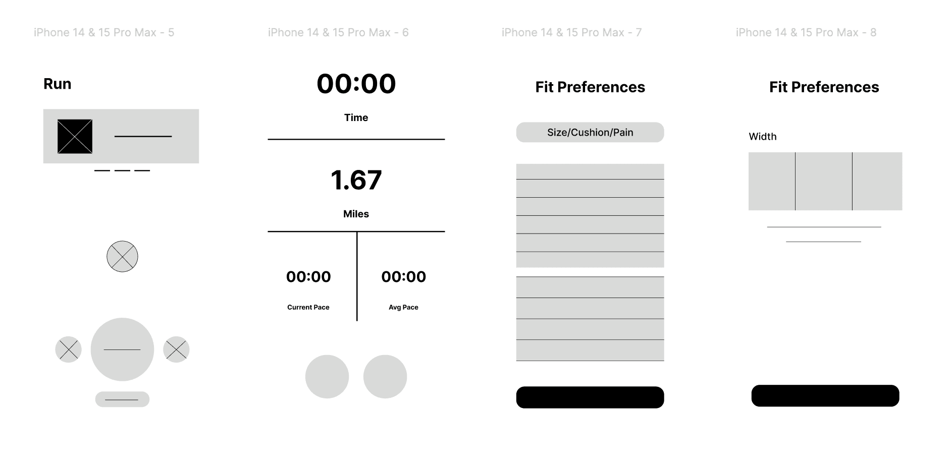
The goal of the mid-fidelity prototype was to expand on the wireframes I drew, considering more of the major elements and how they would appear in a screen-based design. We focused on the onboarding section thinking on the necessary questions in order to tailor users pain points and needs to their perfect sneaker. From here, I was able to showcase much of the outline.
Prototyping
Mid Fidelity Prototype

Testing
Usability Study
We conducted 5 unmoderated usability tests to test the functionality of the application. After gaining valuable insight and
feedback on my prototype, I made changes in the design. The feedback from my users’ test:
1. Shoe Subscription Model
We noticed that some people hate subscriptions so we have decided to change the way we have the model where the
user goes through an onboarding process to help understand what shoes they might like and recommend them shoes
already on the market and they can do a return right away.
2. Running + Listening Experience
Our initial idea was meditation, spatial audio, music matched bpm. However, after user testing we realized we needed to
focus on the shoe data.
3. AR Try-On
Although this is something that would be nice to have. We realized it again did not focus on our app intentions and
our business model was to allow people to exchange shoes based on their running experience so being given an
AR try-on of how something would look and not feel isn’t the direct message we wanted to display.
Prototyping
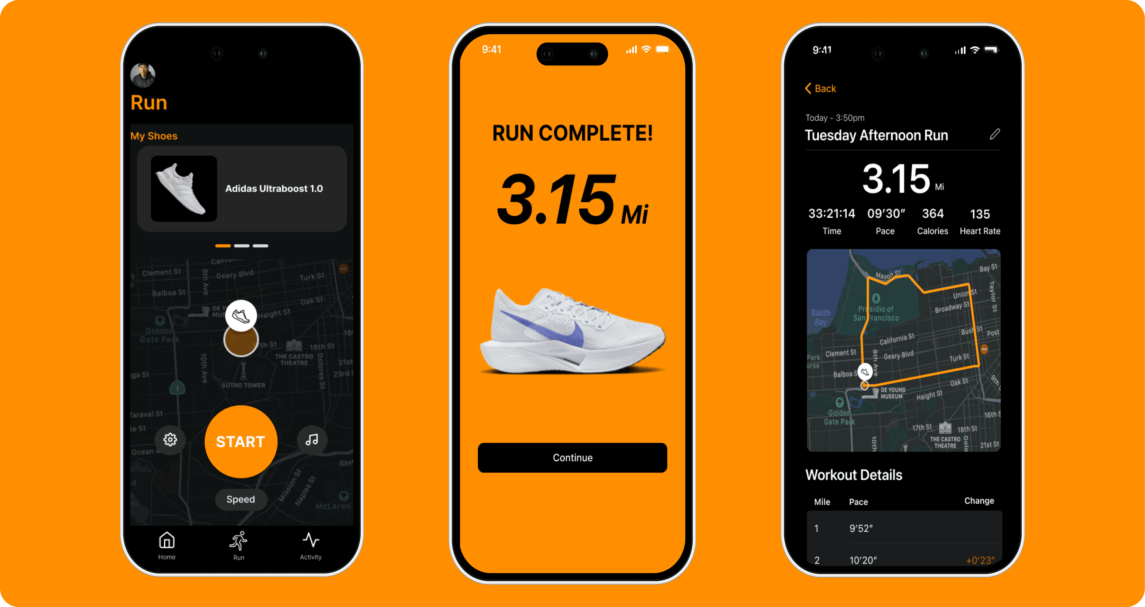
Final Mockups
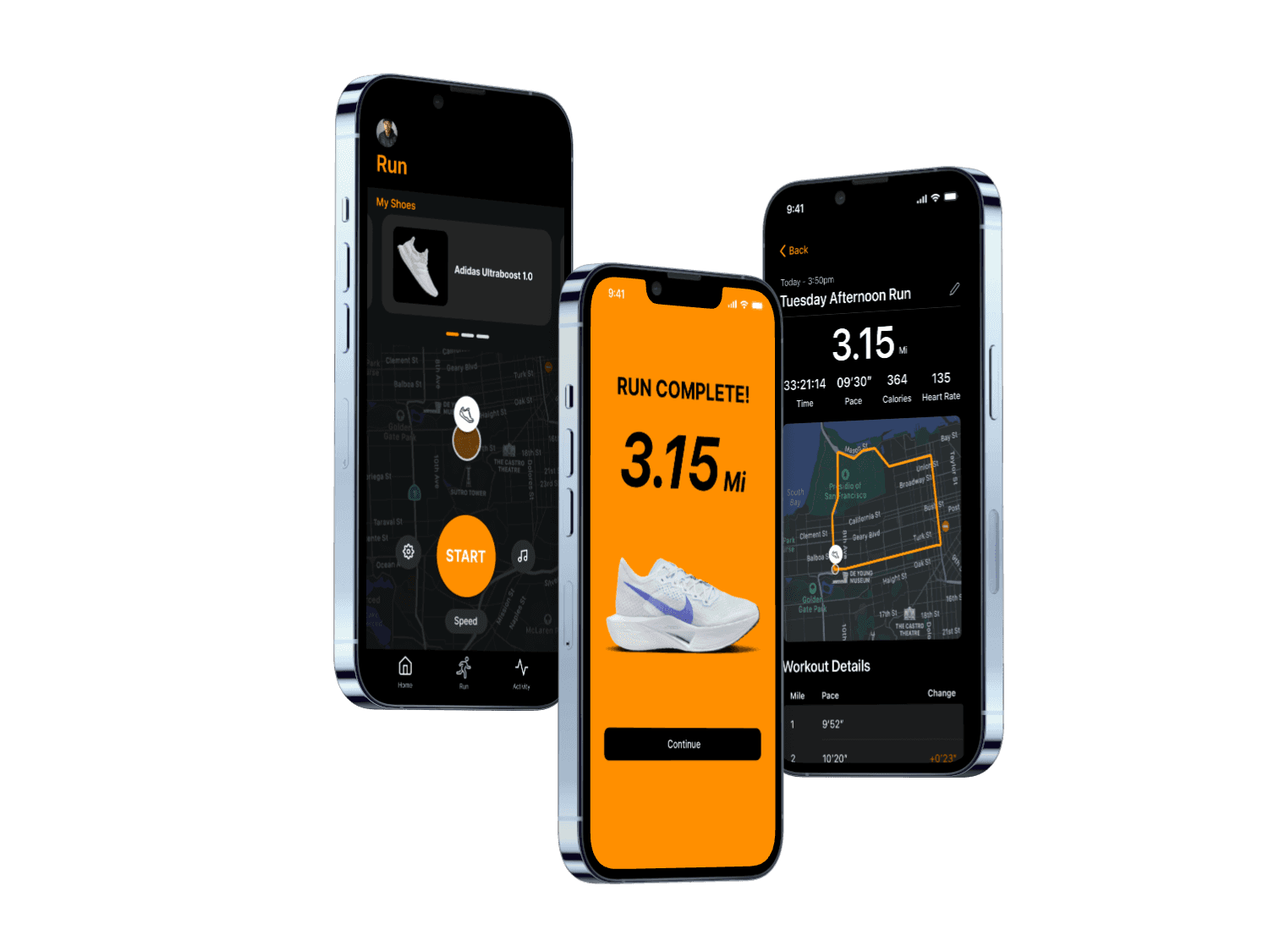
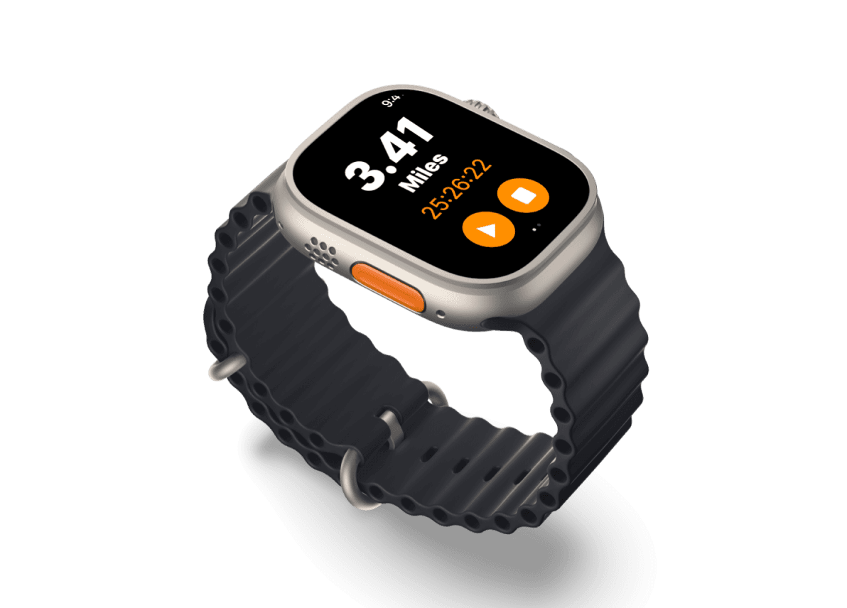
Sole Stride is transforming the way runners interact with their footwear. By tackling the enduring challenge of selecting the
ideal running shoes and facilitating sustainable management throughout their lifecycle, Sole Stride leverages advanced
technologies like GPS tracking, health analytics, and audial extensions. This integration allows the app to offer personalized
footwear recommendations tailored to the individual's preferences and running requirements.
Future
Key Takeaways & Next Steps
What I learned:
Transformative Running Experience
Learned to create a running fitness app aimed to turn running into a comprehensive experience by integrating technology with fashion and comfort. Designed to make running more than just a workout.
Presenting to different Stakeholders
Learned how to present our designs to different stakeholders with different needs such as a senior citizen and a social media influencer.
Sustainability
Learned how to integrate sustainability into our business model through a shoe recycling program and incorporate it into our business values.
Next Steps:
Continuing to iterate and test
We so far have only tested our designs with classmates at UMD. We need to test our app designs with runners and also non runners to gain more insights and iterate on our designs.
Building out more of the pages
Some of our pages are not fully built out yet such as our store page and our values page.
Responsive Web
With the shopping aspect of our mobile application, some user testing suggests that having a website might be better for discoverability and add to the shopping experience.
Sole Stride
Elevating your run with smart tech and tailored treads for a healthier, happier journey, sustained by our commitment to recycling
and the environment.
Role
UX Designer
Teammates
Evan Kim, Ori, Will Le
Date
2.6.24 - 5.11.24
Course
INST 406
Context
Traditional methods of choosing running shoes based on limited in-store trials and static features are becoming
outdated as Sole Stride offers dynamic, customized recommendations that adjust to the user's specific running style and needs.
This shift is reshaping consumer expectations and redefining sustainability practices within the athletic footwear industry.
As a UX Designer, I led the UI designs, User Research, and prototyping.
Define
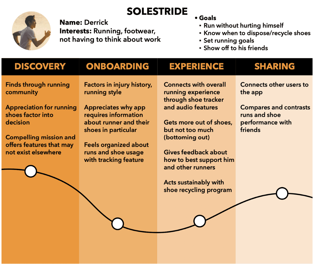
Personas & Journey Maps
The insights I gained from surveys and interviews leading up to the personas. The goal is to display the patterns and pain points of runners, which allowed me to further empathize with users.
