Nearly Wed
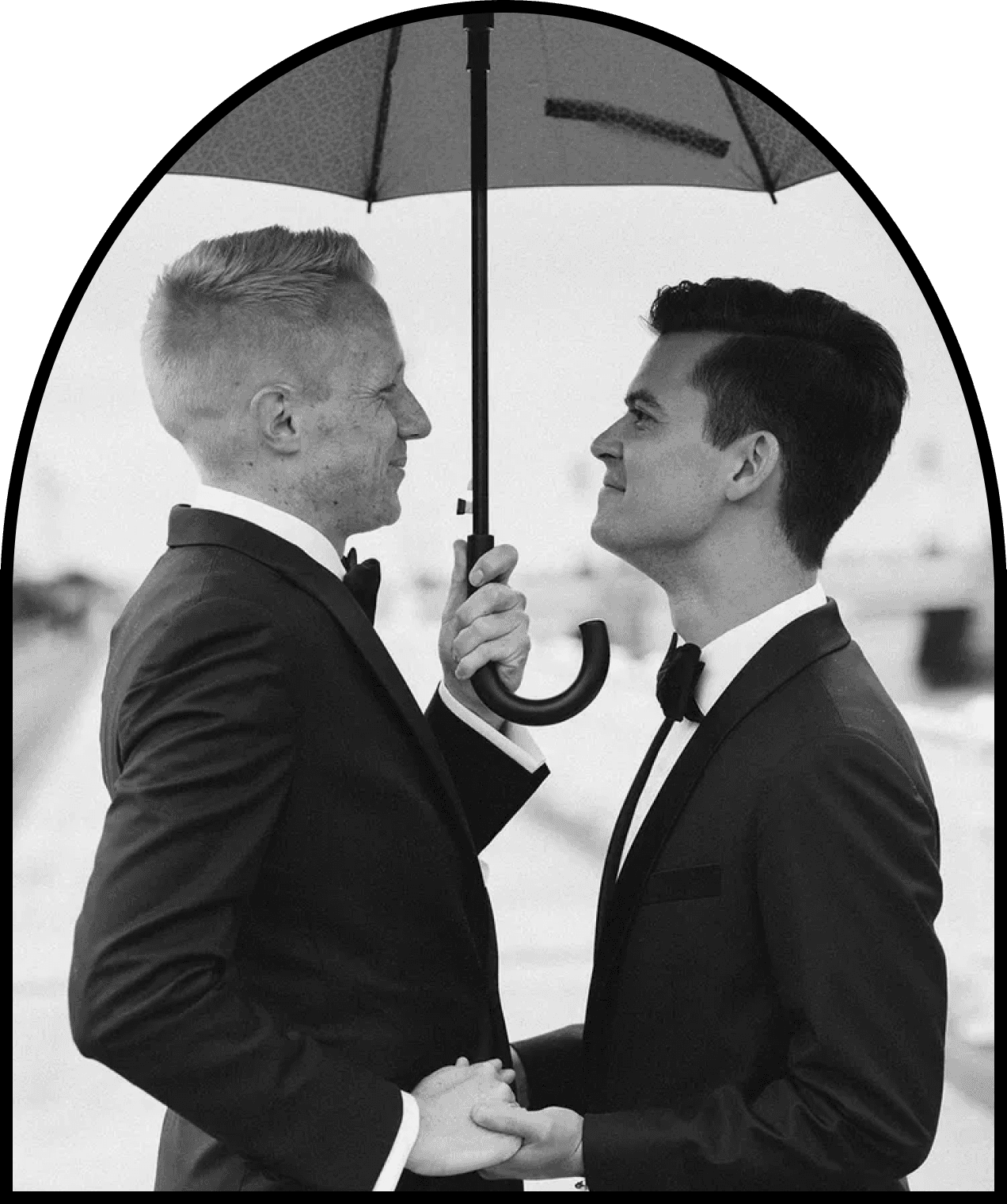
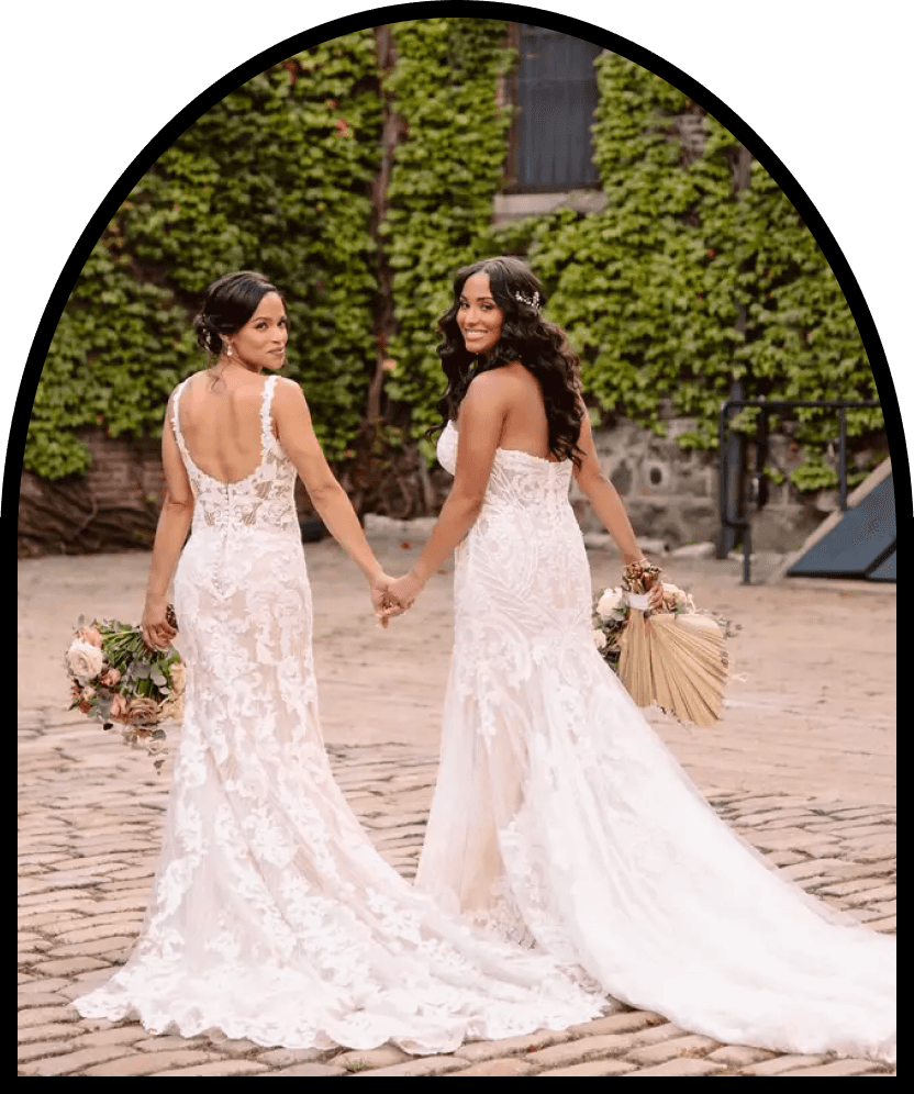
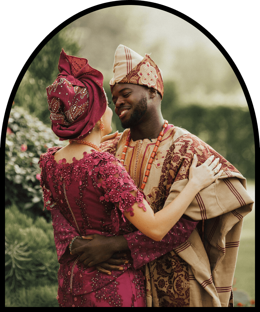
Our vision is to challenge and expand the traditional concept of weddings to celebrate a wide array of cultural, personal,
and romantic expressions.

Role
UX Designer
Teammates
Evan Kim, Roshida
Date
Jan 2023 - May 2023
Course
INST 466
Context
Traditional wedding websites often perpetuate a narrow, heteronormative view of what weddings should be. Nearly Wed disrupts
this outdated paradigm by offering a platform that celebrates a wide array of wedding styles and traditions. Our site provides
dynamic, inclusive features that adapt to the diverse needs and preferences of all couples. This shift in approach not only
enhances the shopping experience but also fosters a more inclusive and representative wedding industry.
As a UX Designer, I led the UI designs, User Research, and prototyping.
User Research
Competitor Analysis
Blends bridal retail with personalized services, catering to the evolving preferences of modern brides, including millennials.
Davids Bridal
Reimagines the bridal experience by blending intimate retail environments with elements of wellness and relaxation.
Lovely
Offers a distinct blend of lifestyle experiences catering to the preferences of millennials.

Anthropologie Weddings
Define
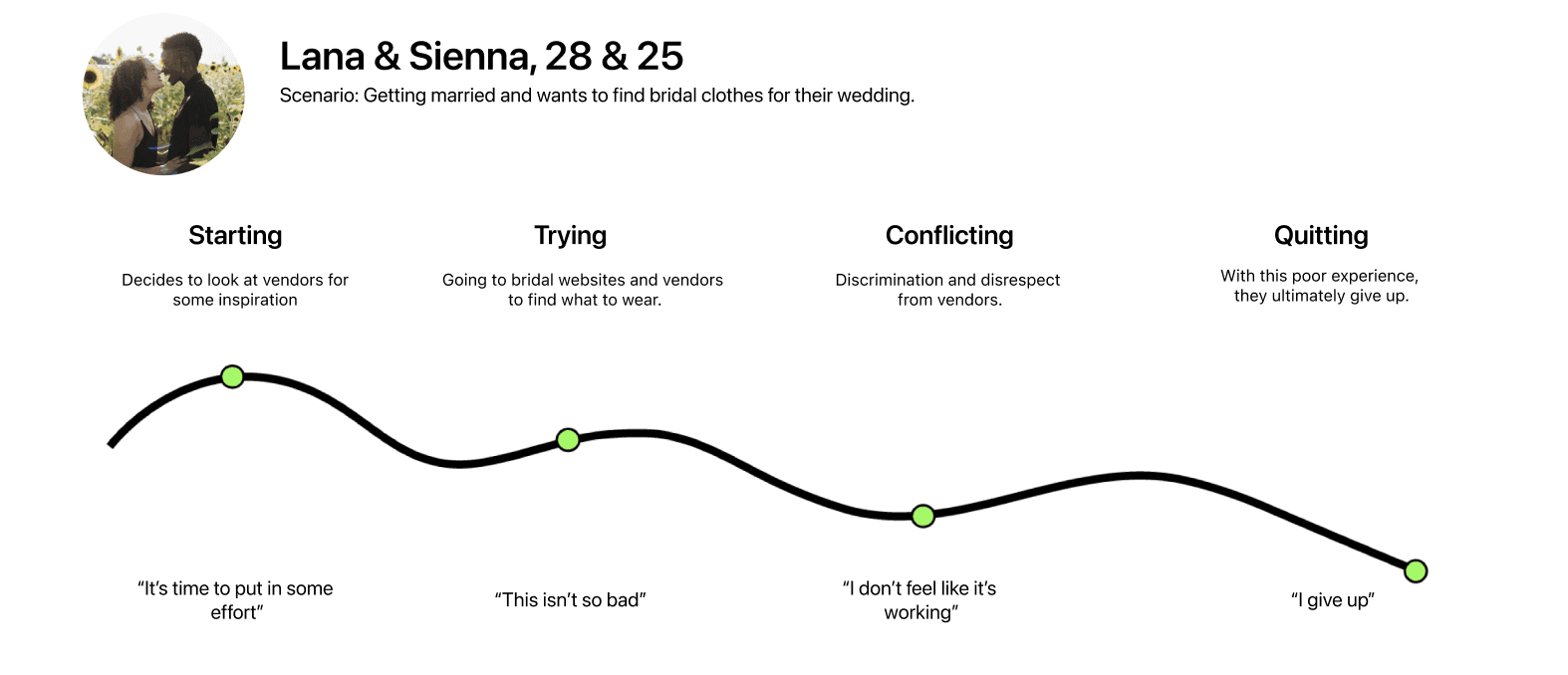
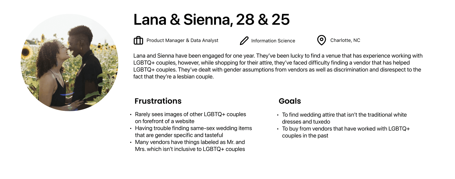
Personas & Journey Maps
The insights I gained from surveys and generative research leading up to the personas. The goal is to display the patterns and pain points of LGTBQ+ Couples, which allowed me to further empathize with users.
Ideation
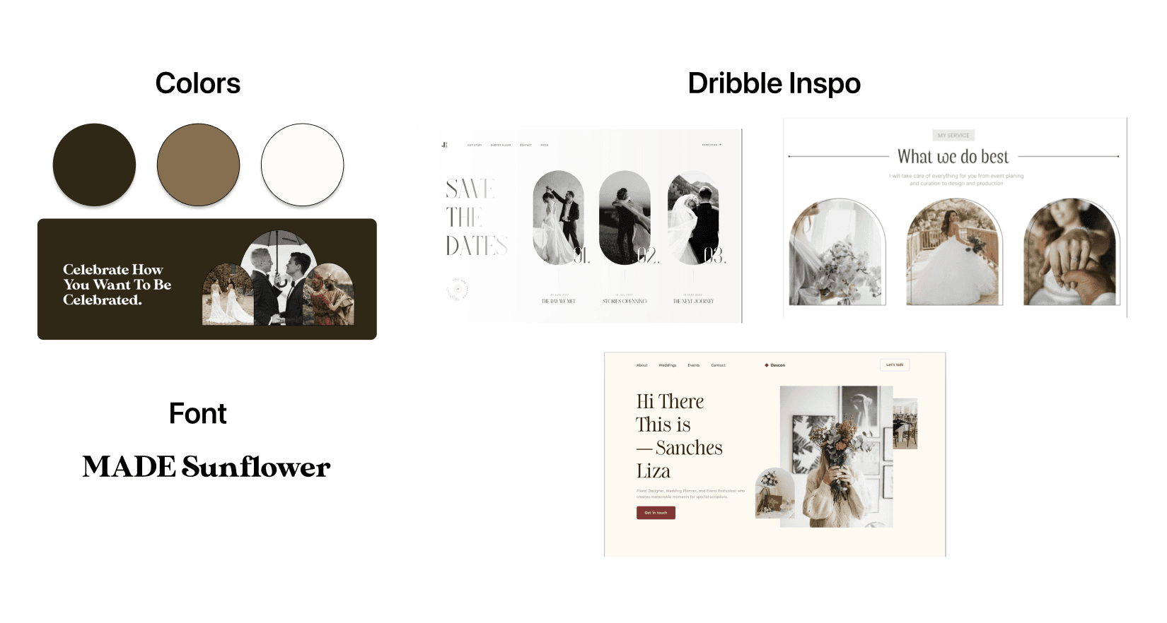
Moodboard
Took inspiration from our competitor analysis as well as websites such as Dribble. We wanted a sophisticated and down-to-earth
theme.
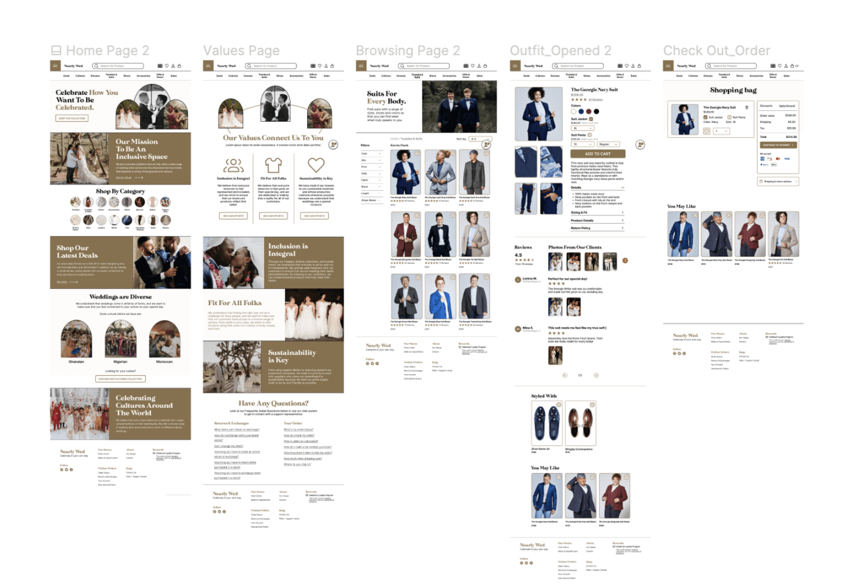
The goal of the mid-fidelity prototype was to expand on the wireframes I drew, considering more of the major elements and how they would appear in a screen-based design. We focused on the branding and thinking about different brands we wanted to showcase through our design. From here, I was able to showcase much of the outline.
Prototyping
Mid Fidelity Prototype
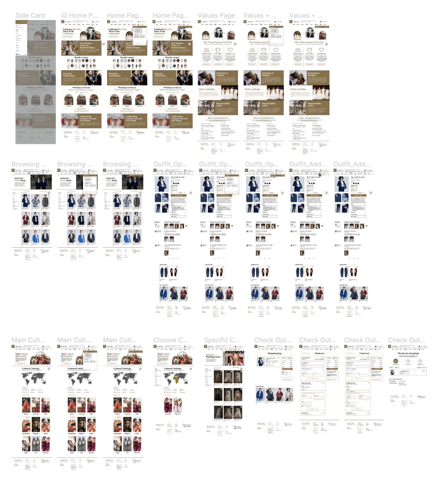
The goal of the high-fidelity prototype was to expand on the mid fidelity prototype and showcase the user flow. We did this by building the shopping bag page, check out pages, and confirmation page for the user to go through the entire flow. We also wanted to focus on showcasing different cultures and chat bot functionality through our design.
Prototyping
High Fidelity Prototype
Prototyping
Final Mockups
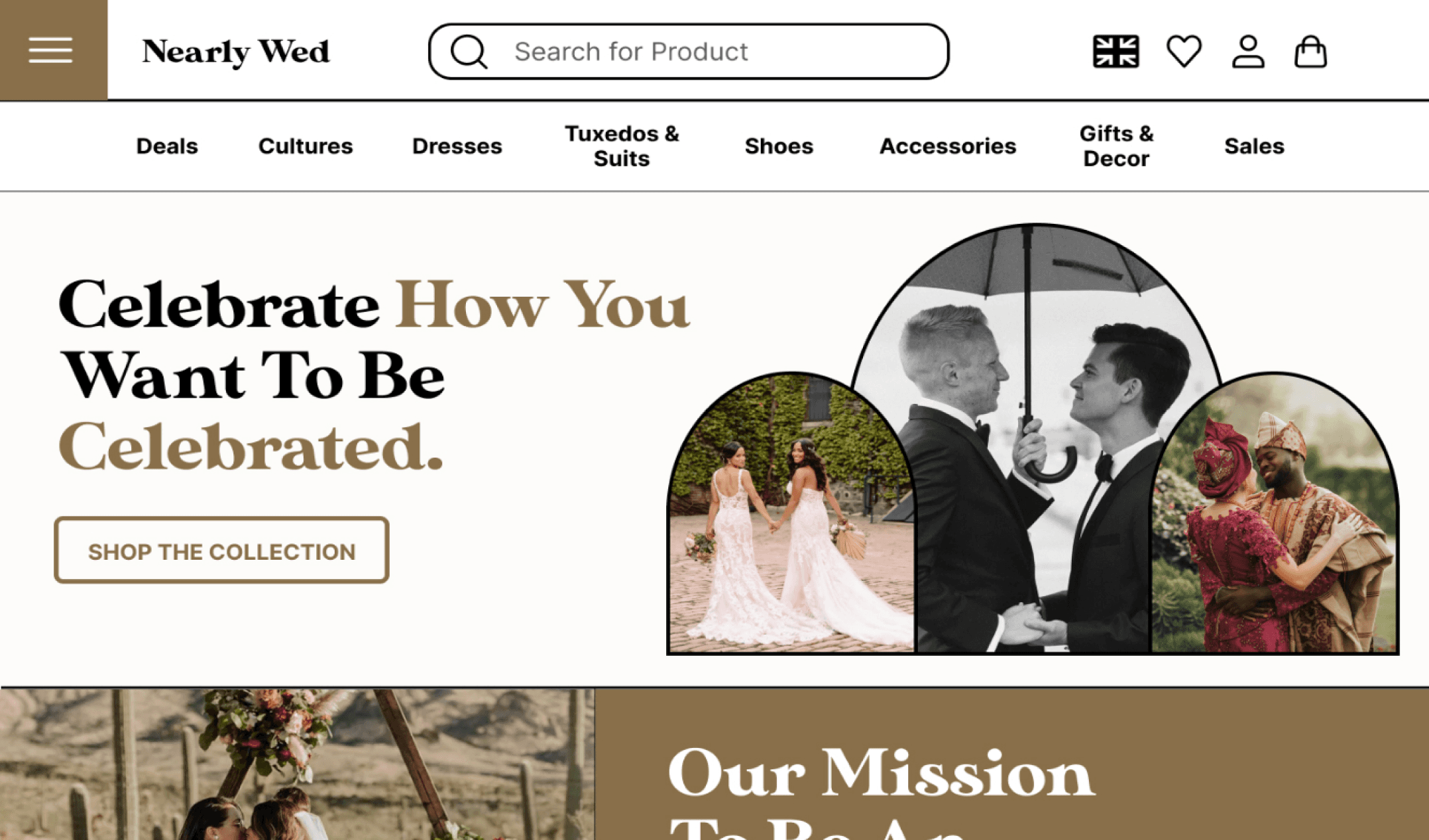
NearlyWed is revolutionizing the wedding industry by challenging traditional norms and embracing diversity. Addressing the lack
of LGBTQ representation and cultural inclusion on platforms like David’s Bridal, NearlyWed celebrates weddings in all their forms.
By welcoming a broad spectrum of celebrations, we aim to ensure every couple feels represented and valued. Our mission is to
provide an inclusive, high-quality online bridal shopping experience that acknowledges and honors the rich diversity of love and
marriage.
Future
Key Takeaways & Next Steps
What I learned:
I learned how technology can be used to exclude certain groups of people from mainstream representations and enforce societal norms. Recognized the significance of representation in design and how to effectively portray marginalized communities.
Next Steps:
More User Feedback
We need to conduct more tests with our platform who are part of the LGTBQ+ community.
Expand Content & Resources
Continue to build on the diversity and inclusivity of the platform by expanding the range of content and resources available.
Finish building pages
Finish building out the screens and prototyping of the settings page, rewards page, and appointment page.
Prototyping
Wireframes/Low Fidelity Prototype
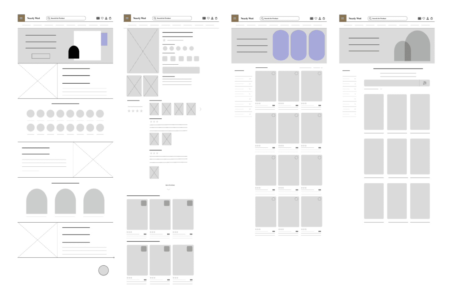
We then started to create our initial designs on Figma to gain a sense of how we can set up our prototype for success.
Testing
Accessibility Considerations
1. Localization & Global Expansion
The top header offers a language switch for site accessibility across different languages.
2. Visual Hierarchy
I used headings with different sized text for clear visual hierarchy.
3. Color Contrast
Ensured all text was legible and met accessibility requirements. Accessible for screen readers.
Understanding LGTBQ+ Couples
In our generative research phase, we first conducted a study on the David Bridals website. We broke down what aspects of the
site were not accessible and which groups of people were excluded. Then, we pulled LGBTQ Wedding Data from The Equality
Institute and were able to pinpoint a couple of pain points:
Testing
Usability Study
We conducted 5 unmoderated usability tests to test the functionality of the application. After gaining valuable insight and
feedback on my prototype, I made changes in the design. The feedback from my users’ test:
Users were 20x more likely to find cultural and LGTBQ inclusive wedding attire that they needed in shorter amounts
of time than on David’s Bridal.
Summary
Celebrate How You Want To Be Celebrated.
For our project, we redesigned David’s Bridal Website. From our readings and class discussions, we’ve seen how technology has
been used to exclude people in society and push an idea of who fits within “normal” standards and who doesn’t. We noticed how
weddings on David’s Bridal follow a heteronormative standard that doesn’t acknowledge that weddings can be different in many
ways, with there being a lack of LGBTQ representation and cultural differences. With our site, NearlyWed, our goal was to enforce
the idea that weddings are not limited to one group of people and that they can encompass a wide range of possibilities.
